The Psychology Of Colors In Event Flyers & Posters For Event Planners
Use colour psychology to design flyers that attract the right Nigerian event audience.
As an event planner in Nigeria, you know how competitive the event space is from concerts in Lagos to bridal shows in Abuja, the first thing that grabs people’s attention is your flyer or poster. But beyond the design and layout, one major factor that can make or break the attention you get is colour.
Yes, colour plays a big psychological role in how people feel, react, and even decide whether your event is “for them” or not.
Let’s break it down in a simple, relatable way.
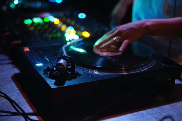
1. Red – Energy, Urgency, and Excitement
Use red when you want to spark vibes and energy. It’s perfect for shows, concerts, club events, or big sales events. In Nigeria, red attracts attention fast, especially in noisy environments like Instagram or roadside banners. But don’t overdo it red can also feel aggressive if not balanced.
Perfect for: Afrobeat parties, Valentine’s shows, nightlife events.
2. Blue – Trust, Peace, and Professional Vibes
Blue gives a calm, mature, and trustworthy feeling. It’s great for corporate events, business seminars, and religious gatherings. In Nigeria, where trust is a big deal, using blue can give your event a more serious and responsible tone.
Perfect for: Conferences, church events, NGO activities.
3. Yellow – Joy, Warmth, and Optimism
Yellow is bright and happy. It shines, especially on social media! Use it when promoting fun outdoor events, family-friendly programs, or kids’ events. Nigerians love warm and vibrant colours, and yellow feels fresh and youthful.
Perfect for: Food festivals, children’s parties, summer hangouts.
4. Green – Freshness, Nature, and Growth
Green is the colour of freshness, especially in this jollof rice and palm trees kind of country! If you’re hosting a wellness event, agricultural fair, or anything eco-friendly, green connects well.
Perfect for: Fitness meetups, health and wellness expos, farming/agric-related events.
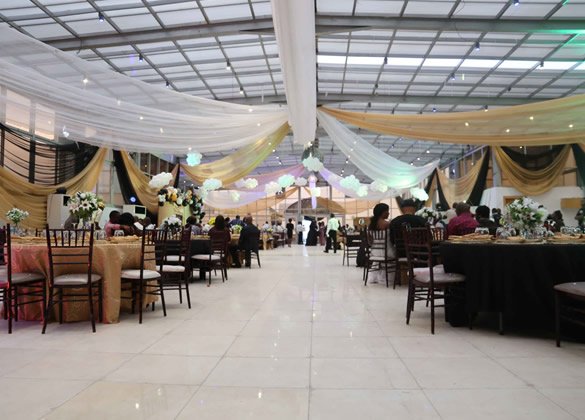
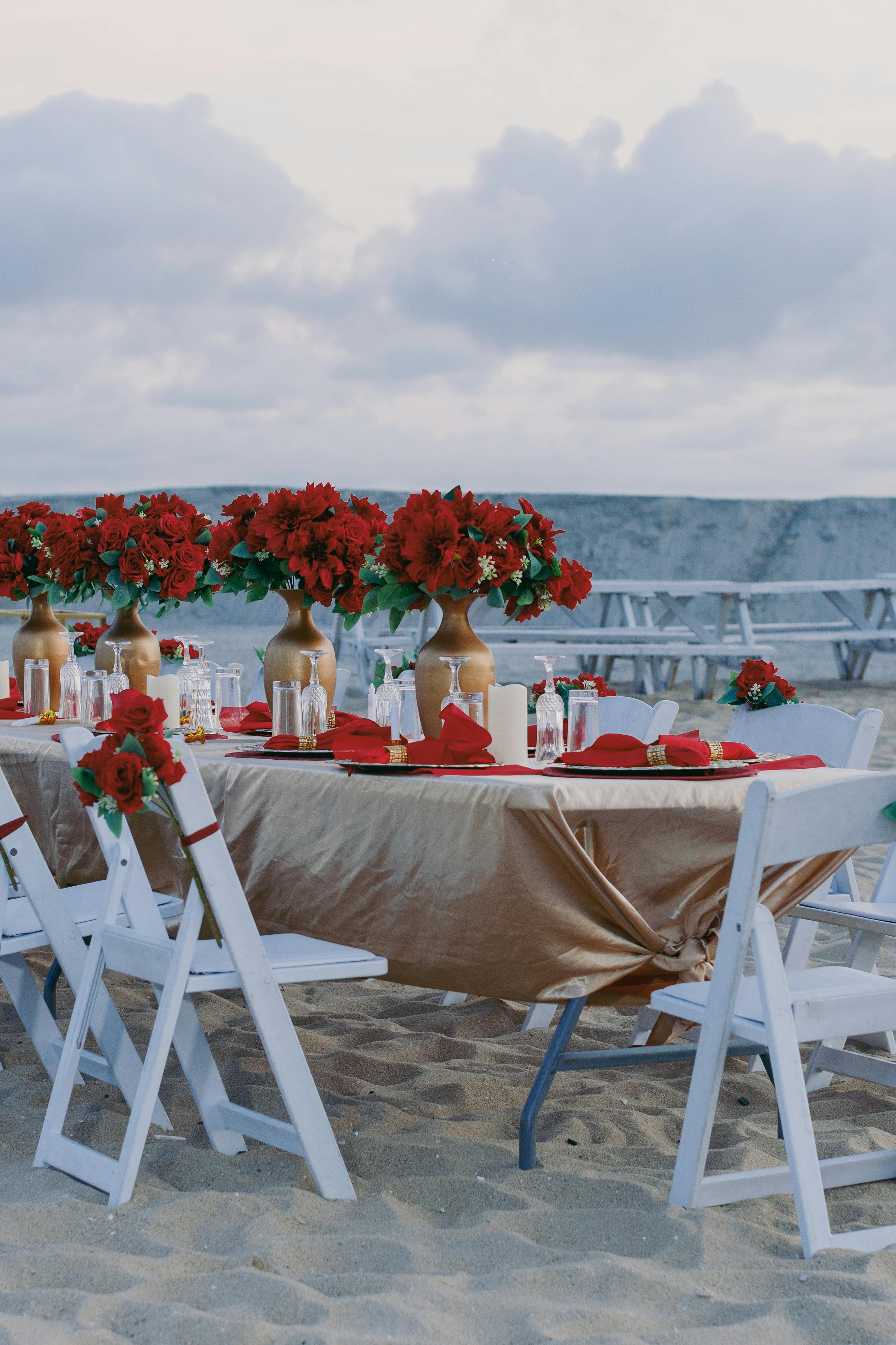
5. Black & Gold – Luxury, Elegance, and Premium Vibes
This is a go-to combo for weddings, award nights, and VIP events. Nigerians naturally associate black and gold with class. It screams “exclusive” and “high-end.” If your event is targeting people with taste, this combo sets the tone instantly.
Perfect for: Gala nights, luxury weddings, premium product launches.
6. Pink & Purple – Romance, Creativity, and Femininity
Pink and purple feel soft, romantic, and creative. Nigerians now associate pink with bridal showers, ladies’ hangouts, and beauty events. Purple leans more regal and elegant good for upscale, classy gatherings.
Perfect for: Ladies-only events, bridal showers, fashion shows.
7. White – Clean, Simple, and Pure
White works well when you want to keep things minimal, peaceful, or spiritual. In a country like Nigeria, white often signifies purity and peace great for religious or family-oriented flyers.
Perfect for: Naming ceremonies, church programmes, end-of-year thanksgiving events.
Bonus Tip: Mix with Intention
Don’t just use colours because they’re “fine.” Mix colours based on your target audience and the mood you want to create. If you’re planning an event in Lagos Island for Gen Z, your colour palette will be different from a baby dedication in Enugu.
In Nigeria, first impressions matter especially when you’re fighting for attention in a WhatsApp group, Instagram story, or roadside banner. The colours you choose say a lot before anyone even reads the flyer. So as an event planner, be intentional. Let your colours do the talking and watch your event buzz grow!
Tags
- #ColourPsychology
- #EventPlanningNG
- #FlyerDesignTips
- #NaijaEventPlanner
- #NigerianEvents